
Building the Pastoral Pioneers of Port Phillip map
10 years ago, whilst searching family history, I stumbled across a book called Pastoral Pioneers of Port Phillip, by R.V. Billis and A.S. Kenyon. The book was an almanac listing the first settlers in the Colony of Port Phillip, now the State of Victoria, and the stations (or runs) that they established.
The almanac had extraordinary detail about each station, including its size, number of sheep and cattle, and a chronology of its ownership, as well as a brief profile about individual settlers.
I thought that this would be an extremely useful resource for family historians and researchers if it could only be linked visually with the a map of the colony and the individual stations. Suffice to say that was a rabbit hole I shouldn’t have gone down.
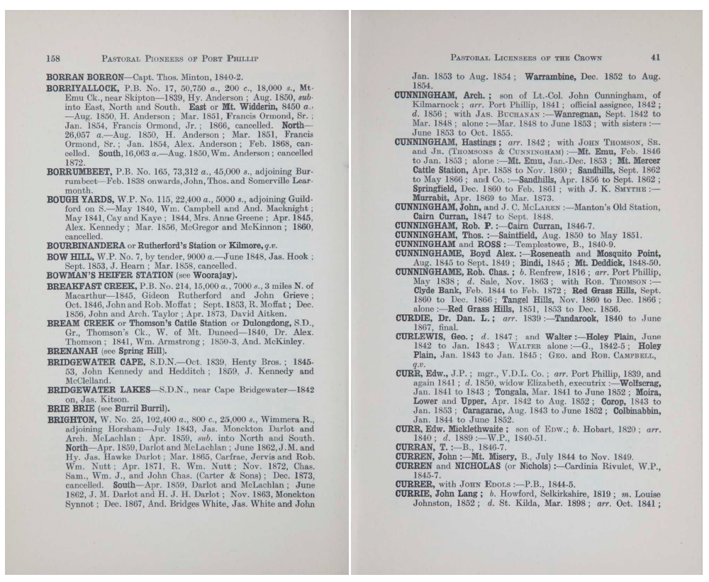
An example of the content from Pastoral Pioneers of Port Phillip.
The Public Records Office Victoria (PROV) contains many thousands of historic maps and plans including maps of individual stations, their subdivisions and broader County and District maps with property boundaries shown. The quality of these maps varies from poorly drawn sketch maps with no spatial accuracy, to surveyed plans. Over time some of the maps have become badly deteriorated with some details lost.
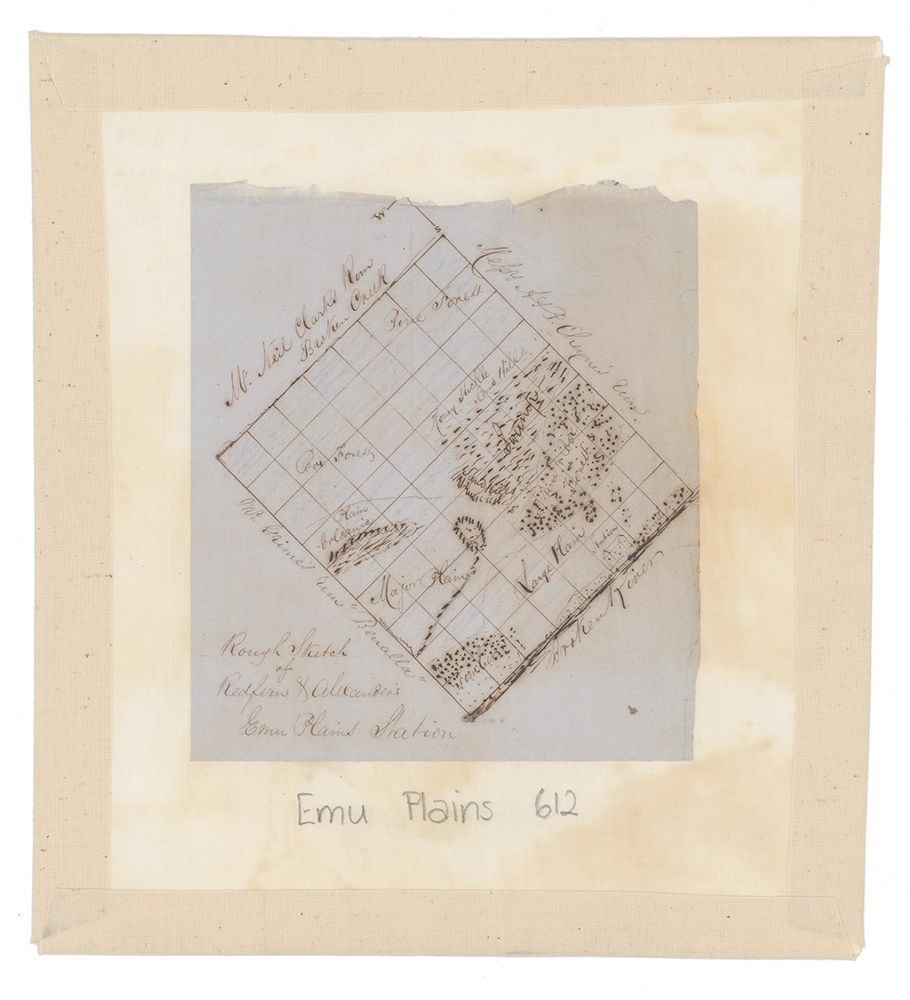
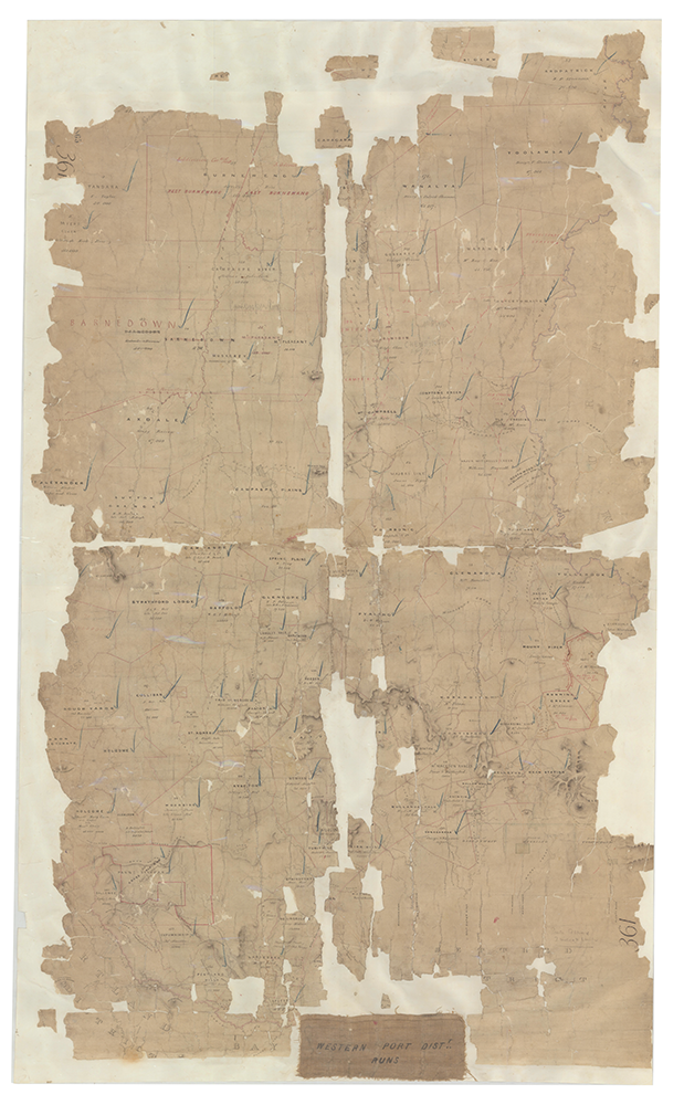
Fortunately the staff at PROV and crowd sourced map fanatics have used the MapWarper platform to georeference many of these old maps and plans. The georeferenced maps are available as WMS layers that can be brought into a desktop GIS, like QGIS, and digitised, which is exactly what I did.
The challenge this presented cannot be understated. Many maps were not accurately georeferenced, not through any fault of the operator, just that the original source maps were never spatially accurate in the first place. Looking at some maps, boundaries were described as a ‘plough line’ or met at a mark blazed on a tree. Some boundaries were obviously following linear features, like a river or road, however many of the old roads no longer exist and were just a cross-country track.
Assumptions had to be made throughout the process - did the cartographer intend that a boundary followed a ridge line? In some cases relief shading or hachuring was used to signify a ridgeline, however these did not always match modern maps.
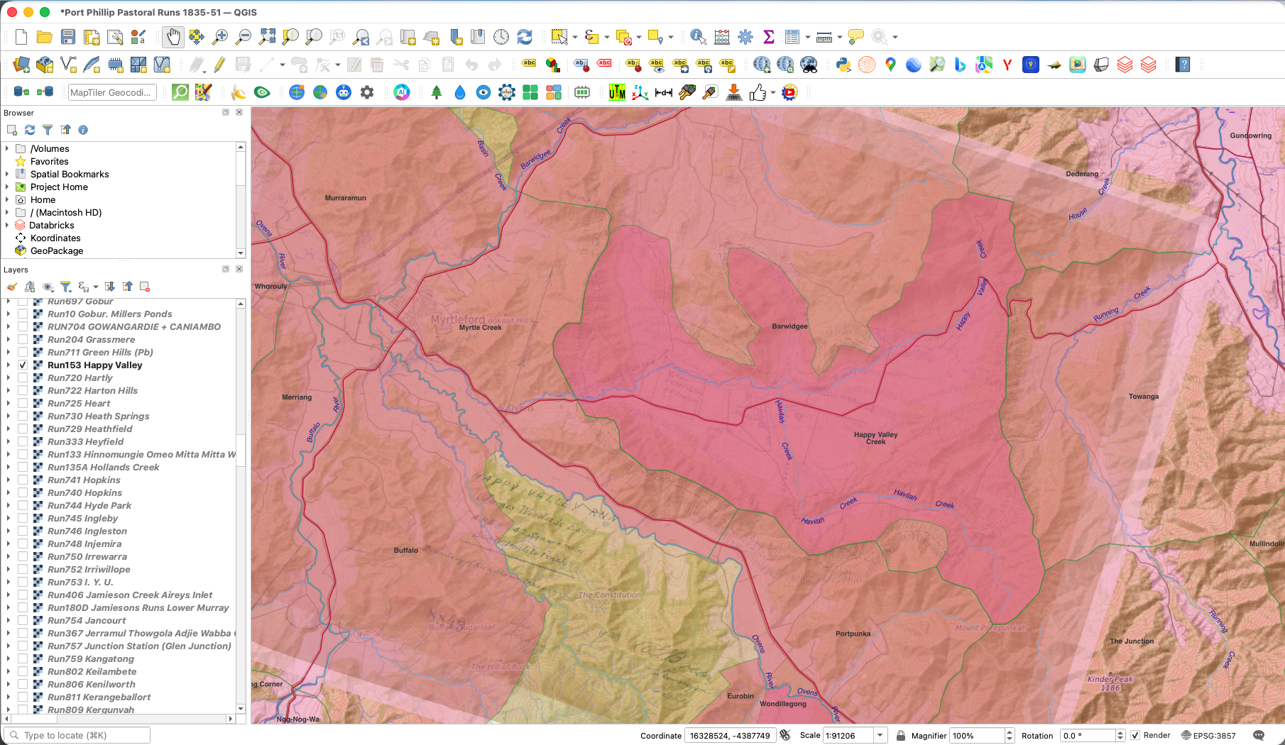
Overlaying georeferenced maps onto modern topography enabled me to delineate boundaries and make firmer assumptions about what the intended boundary should be.
What became obvious throughout this process was that not every station had a map, and not every map had a listing in Billis and Kenyon’s almanac. There were about 450 stations that couldn’t be cross referenced.
Creating the web map
Coding is not my strong suit, but the development of AI tools for coding has made what was once a difficult and time consuming task, and possibly an expensive one, to now something that anyone can do with a little bit of knowledge and a design aesthetic.
I used Claude AI to create this web map in a few short hours. The nice thing about Claude is that you can save your conversation as a project, coming back to it over time to iterate and refine. I was pleasantly surprised with how easy it was to use common sense language to design a web application.
A few things to note is that the base map was created by a human - me - the data was created by a human - also me - and the pop up design and layout was designed by a human - me again. Claude did the grunt work of coding to overlay complex data layers on a basemap, connecting them to a non-spatial database and performed the layout of the web map in a fashion that I instructed.
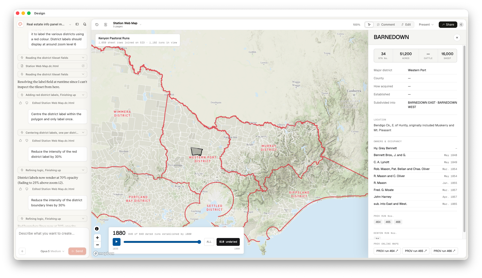
Final output and conversation thread with Claude.
In summary, as a cartographer and non-coder I found the development and production process of this web map relatively straight-forward. When I did hit a hurdle about publishing the map, Claude even gave me the answer about how to host and publish the page on Github. This won’t be the last time I use Claude as a development tool.